Tuesday, 1 March 2011

Post 17; Ancillary Task 2- Film reviews part 1

Sight & Sound
As a part of our overall grade, we are required to produce a film review as well as a postcard for the marketing and distribution of our film.
In order for us to get a feel of how to produce and write up a film review, it was important that we were shown some examples from the industry. We got given examples not from short films, but long feature films, and when reading it we could still apply the features to our short film.
The first article we looked at was an article from the magazine "sight and sound" (which is a magazine used purely for people within the industry) based on a film called frozen, It was released in the United Kingdom in 2004, and was directed by Juliet Mckeon. Based on Juliet McKeon's short film she then went on to make a feature film which was Frozen. We needed to establish that sight and sound is a very different film review magazine, where there were only few articles on short films, therefore to meet the brief, i would have to create an unconventional section of the newspaper/ magazine called "Short Film Special" so that i am able to meet the exam boards brief.
When reading through the article i noted down some of the conventions these reviews have.
The conventions are..
  • A synopsis with a picture is included which is a unique selling point for the film.
  • What actors are starring in it and how good the casting was, even if the storyline was not good it would still be a watchable film. For example in the magazine it states "Henderson is a good actor as she offers an emotional anchor which creates an effective starting point for the story.
  • Comparisons to other films
  • Explanations of how some shots were filmed, gripping the reader in wanting to know more about the film. An example of this could be that in this article it states that some shots are filmed underwater.
  • Words and Phrases- different words and phrases which are used to be a unique selling point, for example "Prize winning" and "style" make us think that this is a good quality film to watch.
We had to change specific elements of the criteria, as sight and sound is a magazine within the film industry which is very hard to get hold of. We also looked at articles from newspapers, and even the Internet which we analysed and got ideas from, in order to match the marking criteria for our coursework.
                                                      
An example of the Frozen film article is shown here, as you can see a picture is shown, quite large to gain the audiences attention.
The text is small and formal, as this article has come from an film industry magazine, and the layout is formal, set our in columns making it easier for people to read.
The name of the film, release date and the directors name is shown in bold, making it easier for us to get first impressions of the film.
The language used in this article would be extremely formal, due to it being an industry magazine, therefore film critics, and professionals would be reading and understanding this language rather then the public. Target audiences used would be film experts within the film industry.


The Independent
After reading a heavy film review article, we had a look at some more articles which would come from different resources, and they would be structured and written in a different way from the sight and sound article. We looked at the Independent which was overall very different compared to the other article. It was easier to read and understand and consisted of less technical language, leading it to be less formal, and often would contain some humour within the article from the first sentence.
The Independents film review was based upon the new film called "The Kings Speech".
  • It was a positive film review, which the Independent gave the film, and we automatically know the film is a heritage film by the style of written communication and images we see on the page.
  • The Image was of Colin Firth, the main Actor, which is also a unique selling point for audiences, knowing someone famous and well known is starring in the film.
  • Within the article it plays upon the narrative, and recalls the audiences attention by mentioning that Colin Firth and this film is up for a BAFTA award nomination. This would also bring in global audiences not only British as Americans are interested in the BAFTA's.

    The Independent would use formal language aimed t middle class people who would be reading/ buying this paper. However, instead of it being aimed at the people within the industry, it would be aimed at members of the public who are buying this newspaper.


The Guardian
The Guardian was similar to the independent, both being newspapers, and unlike Sight and Sound it is easy to read and understand using more informal language rather then formal. Adults who are not film experts who like to watch films regularly would prefer this type of film review, rather the Sight and Sound.
  • The Structure gives alot away about the plot of the film, which draws the readers in, wanting to watch the film, although there is a whole section in the newspaper, which contains a synopsis of the film.
  • The guardian has different marketing materials, for example images, video's and information about the trailer.
  • The review is comical, making readers laugh and creates a sense of humour, making the readers feel at ease when reading this. It uses simple English and is very light hearted.

    The language used in this newspaper, would be aimed at members of the public, and be more informal and humerus when using language to review the film. The target audiences would be different compared to people who would be reading " The Sun" however, the language would be more formal in this newspaper compared to others. 


Public film magazines
Public Film magazines are laid out and structures very different compared to the other two forms of reviews we have looked at. This article was taken from Film Guru.net. This film  review is of a film called I f***ing Hate you starring John T Woods, and directed and written by Zak Forsman. This is a short film, unlike all of the other reviews we have looked at which are long feature films.
The review is written in first person, coming from a person who has just watched the film, giving their own opinion on what their views are.
The reviewers would usually comment on the camerawork, which in this film lacks accuracy, lighting, mise-en scene (hair make up and props etc).
alot with very little.


After reading 3 different types of film reviews, i  have decided about some of the conventions which i will include in my film review.
I will include an image of the main character on set (Isabel)
I will also include a small synopsis of the short film, informing the audience of what happens but not give too much away so there will be no intention of the audience watching it.
Characters names, and who is starring in the film will be essential, along with the director and the length of the film, will be written in small, at the top of the page.
Explanations of how some of the shots were filmed, i will explain how 1 shot is taken, i will do this by choosing on set, the most difficult shot to shoot, which will be a unique selling point and an interesting fact for the readers.

I am going to base my film review on the Guardian review, which i feel will be the most effective, and the one i am most likely to get a good grade in. I like the comical aspects of the film review and find it effective in drawing readers in and wanting to watch the film.

Tuesday, 25 January 2011

Post 16; Ancillary Task 1- Postcards post 1

Film posters
In class we were made to write a list of what we thought we would see on a film poster, a number of elements which most of the class came up with were simple, and usually something in which we would expect to see on a film poster. We are not required to produce a film poster, but a post card, although it is required we are to know about film posters to help us with our postcards. 
As a class we decided that these are the conventions we would expect to see on a film poster.
  • The name of the film-(depending on the knowledge of the film, depends on the size of the font) The title of the film is also a unique selling point.
  • A picture from the actual film which dominates the page.
  • Name of the director
  • When the film will be out (cinemas, the release date e.t.c)
  • A slogan- To catch peoples eye, also known as a "tagline"
  • Actors/ Actress names
  • Style- e.g dark for horror. Or even add in a prop of the film e.g a gun.
  • The small writing, which includes production details.
  • Film company name and logo. (important for independent film makers)
The short film industry does not have enough budget for posters like feature films use, which is why they use small postcards to help reach their small target audience. Short films have the opportunity on the back of their postcards to invite specifically who they would like to come to their first showing of their film, (in which they would put the screening time on the back of the postcard) they cam write to them formally, and individually, which is usually a useful marketing tool for short film makers. 
Short films also market themselves through film festivals which are usually popular, which will eventually increase their audiences. 

Here is an image of a well known film poster. Harry Potter. As we can see the title of the film is not in very big writing as opposed to some film  posters. This is because the image dominates the page and by looking at the big image, audiences will automatically know which film it id from.
The style of the poster is also an indicator of the film, where by the darkness of the poster tells us it is a well known sophisticated magical film.
A prop is also used in this film poster, which is a wand. The wand is a significant feature in the film, which may be essential on some film posters, as in this one.
The "Tagline" is shown on the top of the image, which gives the audience a short clue about the film, catching their attention, and drawing them in to want to watch the film.
Also, the main character is situated in the center of the image which also helps the audience relate to the film, and because of the popularity of the film, making the audiences want to watch it. Production details are situated at the bottom of the page, which you can find on almost every film poster.

This film poster is from the film Role Models. It uses bright colours in which they would mainly be used to suggest the film is comic, and humerus.
The title is in fairly small letters, with directors names directly above it, and images of the actors and actresses underneath the title of the film.
Production details are again situated at the bottom in small writing.
The image is not an image directly taken from a shot in the film, they have taken a separate picture in order for the audience to gain a feel for the type of film it is, we automatically know they are bad role models.
Just like in the Harry Potter poster, the tagline is placed at the top of the image, again drawing in the audience in and wanting to watch the film.


Post Cards.
Posters are not used when making short films, as they are More suited to the bigger films in the industry, which have a higher budget and usually best sellers. Posters are needed for short films due to their big budget, so they decide to produce postcards. They are usually made on a piece of A4 paper, which provides a lack of information on the postcards which draws the viewers in. Post cards often have a graphical design, for example : On a life's edge, and often use it as a way of introducing cast and characters from the short film industry. Postcards can also be sent to people to advertise the short film, as it can be used as a personalised marketing strategy.
Below you will see a postcard produced by the film divine.


The top section of the postcard is a clear space to invite people to your film. The top left hand corner is where the title is situated, and directly below that it states who it was written and directed by, yet another unique selling point.
Straight down the middle is who the film/ postcard was designed by. The website/ crew details and costume and editing list is on the bottom left hand side, which has the advantage of anyone wanting to contact any of the film crew, which becomes beneficial for the film company bringing audiences into their marketing strategy.
It is also important that on a postcard the company's logo is placed somewhere on it, again for marketing strategies. In this case the logo is placed on the bottom right hand corner. Funding details are situated below the logo, informing all audiences where the film got all of their sources of money from.


The tagline "Lets go to church" is placed in the center of the image at the bottom, hinting that the film is about little girls, and their experiences at church, although different audiences can interpret different things.

This postcard is from a different film, on a life's edge. This postcard if structured and presented differently from the one seen above, as it contains more graphical features, and is more presentable. The graphics on this postcard draws the audience in, making it more eye catching and wanting them to go and watch the film.
Like the other postcard the title is at the top left hand corner, and just below it is a small little synopsis of the film. Cast and credit details are placed in the middle of the page along with the duration of the film, and there is little room for writing to invite people to the film.
The logo's are on the bottom of the information page, again


My Postcard designs
My postcard designs took alot of time and thought. We had to think about how we were going to produce a picture that was relevant, appropriate style of writing, and how it would reflect our film in a unique selling point manor. I felt that this task had tested our creativity well.

My first postcard design included a two different pictures which are main features of the film. A teddy bear, and a clock. I decided to put these two together to create the image on the front of my postcard as they represent the film well, and are very important to understanding the message in the film.
Isabel is always seen carrying her teddy and her teddy represents her loneliness in the film, the only thing that is close to Isabel, so i thought this would be an effective Image to make on the front of my postcard.
The clock represents the time, and how long is left until the train incident happens. The clock plays an essential part in the film which is a sign to tell the audience something strange is going to happen.
I have also included the title which is situated at the top of the page, making it eye catching for the audience.
My tagline is just beneath the title which states "Sometimes all you need is attention", i decided this would be a reasonable tagline as the whole message that we are trying to get across in the film is that children need to be loved, and Isabel's parents do not give her enough love and care.
I have put in the rating of the film according to other sources of the media. A newspaper, the times have rated it 5 stars.
The bottom part of the postcard includes, our production groups logo, which is Natural Apple Productions, details of the director, and other participants within the group. For example: lighting director, Production Designer, and Camera operator.


My second postcard design was similar to my first design, however a different image is placed on the front.
This time i chose to include a close up Image of the main character (Isabel) showing her sadness and loneliness. In decided to have her Lent upon a table with her head slanted showing her boredom. Hopefully this will enable the audience to gain a feel of sympathy for the character, giving them an insight of the plot of the story.
The title is situated at the top of the page, in order for the viewers to see it effectively and so the Image can be seen clearly.
I have also included a phrase from a review from another media source, a newspaper, the guardian which states "Short film of the year" this should make it clear to the audience that this film is a film worth watching.
The logo is placed on the bottom part of the postcard, and a space for a small stamp is placed on the right hand side.
At the bottom left hand corner is all the crew details, such as the director, lighting manager, production designer, and camera operator.
Below the stamp space, are small lines in order for us to personally invite someone to the viewing of the film.


My third postcard design, was like the layouts of the two above, yet with a different picture, which is associated with the adults in the film. As my other postcards have been very much linked with Isabel in the film, i thought i would think about having an image associated with Lisa and Simon, as they are still key in the film.
I decided to have a picture of Law books, particularly because the parents in the film are lawyers, and that is their occupation.
The "tagline" is the same on every postcard as i feel it is a good enough tagline to catch the readers eye and make them want to watch the film.
I have also included two statements from different newspapers, from the daily times, and the guardian, these ratings will also be for audience benefits as they would like to know the positive reviews about the film.
On the bottom of the postcard I have got lines to privately invite people to the opening of the short film, our production groups logo is also situated on the left hand side, and on the bottom left hand side are names of the crew and what role they had in the production of our film.

Once i have decided my 3 three designs of the postcards i decided to get some audience feedback of some students who could help me decide which design i should choose for my final design. I asked two different people, a boy and a girl. I decided i would read them the synopsis of our short film first, then i would show them each of my postcard designs.
Both of them said they preferred the third design, which i then proceeded to choose and start creating. The agreed together, that the close up helps draw the audience in to create suspense and sympathy towards the character, and with the synopsis they thought this design would be the most effective, as it reflects the storyline. 

Post 15; Reflecting on Theory

It is important for us as a group to start reflecting on the different theories we learned about in class, and how we can apply what we know to our production, and how each of the different theories does or does not apply to our short film script, and plans we are making.

Genre Theory- From the Robert Smyth School, Genre is categorising films under the labels of science fiction, action, melodrama, horror, e.t.c. In our case our film Genre would be Drama. This is because is takes in alot of emotional events and drama does occur in some scenes. It is trying to send a message across to the audience, which is what every Genre should do in order to survive. ( Paradoxical nature of Genre) "Genre's depend on their ability to change, or adapt in order to survive" and they also have patterns of flexibility as well as patterns of change.
More information about Genre theory (Daniel Chandler)

Within genre theory, it is essential that we are able to recognise the different conventions to ensure we know what genre of film we are watching, and the different genre's that the producers use to categorise their films. This can be determined by a number of factors that audiences should recognise which are, location, themes, narrative structure, lighting, language and music. All of these factors help audiences identify which genre they are watching, so they can relate to the film.
We have to ensure that when making and filming our film, we have these conventions in mind so that we can identify with it, and ensure that we are putting across the correct genre to the audience. Our film could be categorised as Drama, due to the amount of emotion that can be associated with the film, which events happening which is not the normal family life.
For example, during the planning process of the film, we needed to think about the conventions and how they could contribute to the making of our overall film. One of the conventions we thought about was the theme of loneliness and unhappiness, which Isabel, the main character is. She does not have an ordinary child life, and her character can often be associated with neglect.

Another convention we thought about when planning, would be the location of the film. We needed to create a suitable location in which the audience could relate to. For example, the location would be inappropriate if it was filmed in a field. We had to locate the film in a suitable place which could connect with the characters and represent the theme of loneliness and neglect. We decided to film in a house, which would be the family's home and an easy location to get the message across to audiences.
We have added extra lighting sources when filming, these are 85 filters, to warm up the atmosphere when filming outside. We are also using blue gel's in the living room, as the sunlight is too strong, and it needs to be cooled down.

Narrative theory
When talking about narrative theory we often associate it with the way in which the story is told, and how it can be told. This can Be interpreted in many ways, such as fiction or non fiction. Three key theorists are included in this Narrative theory they are Prop, Todorov and Levis.
Prop was interested in Russian fairy tales. He said that in certain films you can get 8 types of characters, a Hero, villain, helper and a donor, a dispatcher, a false hero, a princess and a father who protects the princess, and these 8 characters, do 31 things throughout the film, which is called a sphere of action.
Our short film is not a Russian fairytale, so none of these characters will apply to us in pre production, however, it is useful to have these idea's in mind, and think to ourselves, could the parents (Lisa and Simon) be viewed as the villains, and Isabel to be known as the princess.

more information about Narrative Theory

The second theorist Torodov, stated about the equilibrium, where in every film there is an equilibrium, which then turns into a disequilibrium, and then transforms into a new equilibrium. The first equilibrium states that there is a basic storyline, where nothing interesting happens, and everything is normal and calm. When the disequilibrium occurs, things disrupt the storyline and strange things may happen to create a new situation, which can apply to the new equilibrium. This theory is hard to apply to our short film, despite our main character Isabel not having a normal, steady life in the first place, however, with the train and clock, strange things happen which sends out a message to the audience that this little girl is pining for attention.


The third theorist we can apply to narrative theory is Levis, who came up with the term Biary opposites. These are two clear opposites in which a film can promote to certain audiences. For example: Rich vs Poor can be an example of a Binary opposites. In our short film, we could represent some Binary opposites, depending on how the audiences interpret the characters. Lisa and Simon could represent Evil in some peoples eyes, and Isabel could represent the good, however depending how you interpret the messages and values in the film will differ whether you can recognise Binary opposites.

Audience Theory


Media know it all- audience theory

The first Model associated with audience theory was the Hypodermic needle model. This model is also kn own as the effects model, where the audience is seen as passive, where the producer then sends a message to the audience in which they will relate to. In our case, Anton the producer wanted to transmit the sadness of neglect across to the audience which will make them realise the importance a child's behaviour can be.


Another model connected with Audience theory is the two step flow, this was brought about in the 40's and suggests that the audience is still seen as passive, however, the producer uses something/ someone else to relate to the audience. In this case the message gets to the audience via something else whether this be a prop, a special object etc. In our short film, the teddy or the clock are two clear significant objects which can be used to transmit our messages through to the audience.

The uses and gratifications model came after the two step flow, which emerged in the 60's. This theory suggests that the audiences are not passive, they are active. It is not all about the producers sending out messages and how they interpret their specific messages, it is also about what the audiences want and need. We have to accept that all audiences are different and react differently to different things. In our short film, we hope that the audiences will take away        different messages that are set out in out film, about why parents feel the need to ignore their child's needs.

The last theory linked to audience theory is Reception theory which was developed in the 80's and 90's. This theory stated that each individual perception would effect the interpretation of the texts. For example, this could mean age, gender, ethnicity etc.  The theory also states that the message is encoded by the producer, and decoding by the audiences. For example Anton, our director has his own interpretations of what he wan ts to encode in the film, when audiences it is down to them if they decode the messages the way Anton put them across, or whether they interpreted them differently.

Tuesday, 7 December 2010

Post 14; Pre Production Documentation

 As set designer, it is my job to create costume designs for each individual character and illustrate why they are dressed the way they are.
The daughter is a young girl who is pining for the attention of her parents. I started off by creating costume for the 11 year old daughter which consisted of leggings, a skirt and a short sleeved top. I decided that her top and skirt would be an expensive brand make, which will represent the wealthiness of her parents.
Her leggings will demonstrate her youth, and how the younger generation are often pictured in leggings. Leggings are also a modern piece of clothing, which have only recently been around in today's modern society. I thought that this will also show how our film is modern and we will be shooting in today's contemporary society.
Isabel's shoes are small dolly shoes, which again represents her youth and how the younger generation in today's society are growing up fast.
I added in jewelery which may/may not be necessary in shots, however it shows how much wealth her parents have.


 The next costume design i produced was the father, Simon.
Simon is a stressed character whose life revolves around work. In the shots Simon has just returned home from work, tired, frustrated, and he devotes alot of time to his case.
Simon is a dominant character which is shown in the short film. The way he dresses, shows his importance to the storyline which gives off representations of a wealthy respected character to the target audience.
I decided to dress him according to his occupation (being a lawyer). obviously lawyers are smartly dressed and are often seen wearing business wear.
I designed Simon to have his top button of his shirt undone, which connotes the fact that he is tired and is in desperate need of relaxation. The suit represents this character to be a hard working and wealthy man.
As he is wearing no tie, and we see it thrown over a chair in the office, it shows that he is tired, very hot and extremely busy, therefore has no time to play and pay attention to his daughter.
The blazer Simon has, will also be shown on the chair in a messy state. Again showing his tiredness and dedication to his case. He is also hot and flushed, meaning he will refuse to wear his Blazer.
I thought that as Simon is wealthy it would be necessary to show him wearing expensive shiny shoes, patient leather.


Lisa, the mother is just like Simon Lisa has just come home from work, tired and flustered.
I have shown Lisa wearing her blazer, but in certain shots her blazer will not be on, again representing how hot she is which is normal for when people arrive home from work, their first instinct is to undress, or dress down.
Lisa will be shown wearing a baggy shirt, showing she is tired. Lisa is more laid back then Simon, and is well a well respected character who looks after herself and her appearance. This can be shown through her cleanliness and the quality of the shirt she is wearing.
Lisa will be shot wearing a short skirt. This shows that she is comfortable in her appearance, and the environment she is in, which is her own home. Therefore, she can relax more and shit down comfortably whilst her husband is the complete opposite.
I decided to have Lisa wearing high heels due to her job, and the fact that she is an overall smart person, and being a lawyer you need to be smart in your appearance.


I also created a mood board for the mother and father characters, of different sorts of suits that lawyers generally wear. I gathered pictures and created a collage, i then based my costume designs around the mood board, and what type of things the lawyers would wear. In the end i decided upon putting the mother in a suit, and skirt, and the father in a pin striped suit, which can be seen above.


For the young girl, i also created a similar mood boars, and gathered together pictures of the younger generation, and the sort of things they usually wear. When i typed in young girls clothes, the majority of pictures that came up were leggings and jeans. I came to the decision that i would put the young girl in leggings, purely because her parents are a wealthy family, which will also represent more of a modern society.


Character Profiles:
As production designer i also needed to create character profiles, to show what each of the characters would look like, and a description of what sort of character they are. I started off with the young girl Isabel, who is a delicate and lonely character. The image i added was a lonely girl who is sitting on the stairs. The minute you look at the picture it is clear to see what sort of a character this child is.


Simon's character is a dominant character, and i included a picture of a male lawyer, stating his importance, and wealth. He looks like a professional person wearing an expensive suit. On screen, Simon will be shown in a particularly negative way, as he neglects his daughter and focuses too much on his work.


Lisa, the mother is very similar to Simon's character, which can be shown in the scenes. However, Lisa is more of a laid back character, who is hard working, professional (which is shown in her appearance and the way she looks after herself). Unlike Simon she is not aggressive, nevertheless she doesn't take much notice of her child.


I wanted to find out what sort of things you would find in a lawyers office and i came across a website which stated how an office like this is usually decorated.


I then came across a picture which illustrated directly what i needed to create.

As you can see lawyers usually have certificates of achievement up on their walls, which i need to make sure i can create something that looks similar to these achievements.  A leather chair is also something i would need to think about, however it would be difficult for me to get a leather chair into the house without Anton having one spare in his house. To make the office look more realistic i am going to need to place a lamp to create a calm atmosphere of a wealthy lawyers office.
Laptops and computers are something else i need to make sure i have a sufficient supply of. A computer flat screen (apple Mac) will need to be placed in the room which will be easy accessible as there is one available in the house we are filming in. Laptops will also be bought into the office to make it look more formal, which will again represent the wealthiness of the family.
Other factors i need to consider is how i am going to get a glass frame table into the room, as the only table available is a soft wooden one, it may be an option for us tom play with different lighting techniques to get a soft glow off the table.

However, something interesting i found in my research was the picture above, (the lawyers office) was originally inspired by this picture from Harry Potter. I also found an interesting quote in which i will need to consider when designing and thinking about managing the props when filming.               Krin Eldor of AskMen.com noted, ”the key to decorating your office is maintaining that perfect blend of professional and personal. Always keep in mind that this is still your office, and you want it to look like a place of full concentration, especially when clients or higher-ups pay you a visit. So i will need to include both personal and professional belongings, such as a picture of their child (maybe not in our film's case as the parents do not seem  to care much about their child), and professional belongings such as graduate certificates.

Below, you will see i have thought of some ideas which will be included in the lawyers office. I have put together a small spider diagram which illustrates some of the conclusions i have come to about what objects and props which will be placed in the office, and/or on the desk. Obviously not all of the props i want to include will be shown on the diagram, as time goes on and during the production period i will add more props which are suitable to the shot.


Location Reccee.
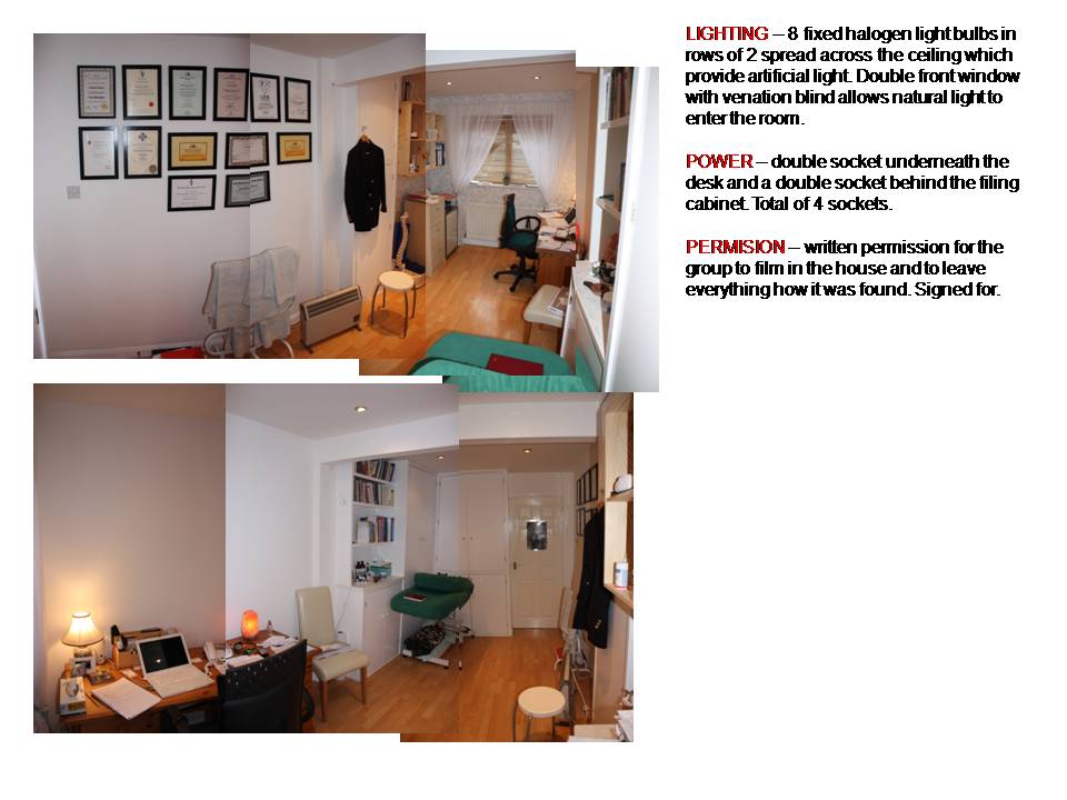
The location reccee consisted of pictures which were taken in the locations we are filming, and putting them together to create a picture of what each room would look like. Tim, who is in charge of the camera, took these photo's in a house, in which all of our production will take place. Each separate room where we will be filming have been displayed in the photo's, for example, the shed, office, and living room.
The director added the notes beside the pictures which illustrates the power, permission and lighting. The power will give us information which will be around the house during production. The permission will need to come from he house holder's in our case, Anton's mother and father, the permission will need to be written down and signed by the owners of our location. (Anton's house). Lighting is for where the different light sources are within the house. Natural light will be used with gel's and occasionally an 85 filter, this will all need to be written down and recorded.
Below are our group's location Reccee photographs.


Final script
The final script will be shown below, after a number of drafts the script as finally edited to our needs. The teacher, the director and all of our group were happy and satisfied with the overall script. We read through it a number of times to familiarise ourselves with the scenes and shots, and creating an image in our heads of what we are filming and how we are going to go about it. Reading the script a number of times ensured we all knew what we want to achieve.


Storyboard
The storyboard was the longest and most difficult task. All of the 4 members of the group needed to take part and do at least 2 scenes of drawing, in which we all did. Considering most of us are not the best drawers our storyboards needed to be edited a number of times in order for it to be effective when scanning. The director, Anton did the first 2 scenes, Ryan did the next 2 scenes, Tim did the other 2 scenes, and i did the last 2 scenes, so overall we all had an equal amount of work to do. After we had all done our drawings, we found that some were missing, and we needed to go over them in darker pencil. Some of our drawings did not match the correct shot size, so we then had to re-do some of the drawings, finally after all of our changed were made it was time to be scanned.
Anton (the director) drew and developed the images for the first four scenes. Tim the camera operator did the next four scenes, Ryan the lighting operator did the other four, and i completed the last 4 scenes of the storyboard, and added in the missing imags for the ones that were missing at the end.
The storyboard will be shown below.


Lighting Plans
0ur lighting operator had produced some lighting plans which would illustrate the layout of each location (room) from a birds eye view, and where abouts the different lights will be situated in the room. The images show where each light will be and what we hope to achieve with the different positions of the lighting. For example: a blue gel positioned over the camera will naturalise the filming environment and make everything more naturalised. However, if a 85 filter, was placed over the camera, the filming environment would be a much warmer picture and create more warmth for the filming environment. Below is the lighting Plans for the living room area in which we will be filming.


 In scene 2 we will be using 1/4 blue gel to put over the spotlights. We are using this to try and decrease the orange effect being created with the natural lighting coming through both windows when mixing artificial lighting with the spotlights. The 85 filter will be used to block out most of the natural lighting and allow the room to have a much clearer and warmer effect. We will also be using a full diffuser and pro light.


 For scene 4 we will be using 1/4 blue gels to put over the spotlights. We are using this to try and decrease the orange effect being created with the natural lighting coming through both windows then mixing the artificial lighting with the spotlights. We will also be using an 85 filter with the spotlights, which will be used to block out most of the natural lighting and allow the room to have a much clearer and warmer look. A diffuser and pro light will also be used during this scene.


In scene 5 we will also be using a 3/4 blue gel which will be placed over the spotlights. This will decrease the orange effect in which we don't want this to happen, an 85 filter will also be used to be placed over the camera, to block out most of the natural lighting and give a much warmer look to the atmosphere. Again, a full diffuser, and pro light will also be used.


The lighting plans for the office scenes are shown below.


 For scene 3 we will blue gel to put over the spotlights to get rid of the orange effect which will occur. We will also have a lamp on the desk to create a more office like atmosphere, the 85 will then be used to put over the camera to warm up the atmosphere.


 In scene 6 we will also have a blue gel placed over the camera, which will tone down the orange effect caused by natural and artificial lighting. A desk lamp will also be used to create an office like feel to the scene. The 85 will then heat up the room and create a warmer tone to the scene.


Shot List
The shot list is used for us to accurately calculate each shots that will be in each scene. It is cut down from the script and is divided into different parts, Location, scenes, shots and a description of each shot. This will help us to become more organised and accurate when filming, so that when we are on set we know each shot in detail, and are ready to film.


Costume & Props list


The costume and props list was created by myself, being production designer purely for organisation purposes. We needed a detailed idea in a clear format of what we wanted out characters to look like, and what props they would need for each scene. In the table shown below, i have identified scene by scene what each character will look like (Clothes, shoes, make up etc..) and the props that will be shown with them in the scene. The teddy bear will b e shown in every scene, due to Isabel becoming attached to the teddy bear and it being a significant object in the film.